You have found the article you are looking for.
So you are interested in conversion optimization and want to find out what it is and how it can help your business?
Conversion optimization is the practice of improving the performance of your website and forms so that you can turn visitors into possible customers. You may also hear about CRO which is conversion rate optimization.
The practice of improving your website conversions should be one of the top digital marketing strategies you focus on.
So let’s dive into what you need.
- Don’t stress on your conversion rates.
- Good customer experience improves your SEO.
- Basic strategies for increasing website conversions.
- Top reasons visitors don’t fill out forms.
- 10 Tactics to increase form conversions.
- Thinking about mobile visitors.
- 5 traits of compelling headlines to pull in your audience.
- Optimizing your CTA buttons.
- Using videos to improve conversions.
- What to do when conversion optimization fails.
Don’t Stress Out on Your Conversion Rate
Many companies that begin conversion optimization see great improvements in conversion rates quickly, but this can be misleading.
A conversion rate is simply the number of people that visit your site and/or form page that actually completes the form.
If you always have 1,000 people viewing the form every month, and it never goes up or never goes down then measuring a conversion rate is fine.
But like any business, you want LOTS of people (they need to be quality of course) making it into your funnel and visiting the form page. The problem is as you increase the number of visitors, the conversion rate is going to drop some because the number of people converting is NEVER the same as the number of visitors increases.
Because the number of conversions does not grow at the same rate as your number of visitors, it will seem like the conversion rate is dropping, which, of course, it is.
We don’t want the executive team going into a panic when conversion rates drop simply because you did a good job of growing your audience.
Instead, focus on growth rate, which is simply the rate of growth for the total number of leads (or sales) in a given time period.
A growth rate is independent of your incoming audience and if you are trying to improve the number of people who convert, this will go up if you are doing better.
Good Customer Experience Improves SEO
Ever heard of Google Rankbrain? If not, that’s okay.
Google Rankbrain is their AI platform that analyzes the search result you click on and how much you interact with the page you visit. In other words, if you click on a search result and stay on the page then Google knows it was a good result for your search and will rank that page higher.
This means that both your content and your user experience need to be good enough to capture and keep the visitors’ interest.
Basics Strategies You Need to Know to Increase Website Conversions
Get to Know Your Visitors.
You need to look at who is coming to your website today. Not just the people you want to visit, but everyone visiting your website. To understand your visiting audience, take a look at the sites they come from, what keywords they searched on, where they are geographically and what content they interact with. What you may find is that a large percentage are bouncing after a few seconds. This could mean you are doing a good job of driving the wrong traffic or that your website doesn’t match what people were expecting. Know who you want to visit your site and go after that audience. If you are getting the wrong traffic, try to understand why and you will be rewarded with better visitors.
Funnel Visitors to the Conversion.
Look at the traffic coming to your website to understand the paths that people take through your website. Where page are they landing on? What pages are they looking at? Where are they exiting the website? Then make sure that your conversion action can easily be found and matches the content on that page, otherwise, you will be asking them to take the wrong action and lower your chance to convert.
Be Worthy of a Conversion.
Is the asset (whitepaper, webinar, event, ebook, download) you are providing behind the conversion useful to the visitor? Does it help them somehow in their daily life or job? Is it worth the person giving up their personal information and thus increase the amount of email they receive and a potential sales call if they give you their information?
Provide What is Promised (and more!).
You only have one chance with most visitors filling out a form. Make it a great experience and give them what you told them you would. Don’t make your visitors jump through extra hurdles to get what they wanted. When you can, try to give them more than what you promised. It is all part of establishing your brand as better and therefore more memorable. Turn them into impressed fans right from the start.
Be Helpful.
Always send a confirmation email that contains instructions, additional information and appropriate links so they can continue to do business with you.
If you follow these five simple strategies, then any website can increase conversions and begin moving into more advanced conversion improving techniques.
Top reasons people don’t want to fill out a form?
Let’s face it, most people do not want to fill out any kind of form on your website, but there are a number of things you can do to improve the odds.
Here are the top reasons they may not fill out a form.
Fear of salespeople.
Whether you have an active sales force or not, the impression people have is that some salesperson is going to pester them endlessly if they fill out a form.
They don’t want spam.
We both know you don’t spam people, but your visitors don’t know that.
They don’t have time.
Some forms are multiple pages long. People already don’t want to fallout your form, why put more obstacles in their way?
Gaaaahhh! You have too many fields.
If your form is lengthy, who has time for that? Don’t make your visitors think. Get just enough info you need.
ADD. Something shiny attracted them.
Sometimes there is a lot of really interesting stuff that might pull them away while on the form page. Get that conversion first.
They truly are not really that interested.
Unless you are totally awesome, this is going to be a big chunk of your visiting audience. They probably just came there because your content is awesome. Right?
Not interested… RIGHT NOW.
If they have gotten as far as a form, most likely they like what you have to say, but just are not ready to commit to anything. Find a way to get their email to keep nurturing them over time.
So if those are the primary reasons people don’t fill out your forms, what are some of the things you can look out to make people more likely to fill them out?
Ten Tactics to Improve Form Conversions
- Don’t use a plain old contact form. Give people value for giving you their information. It may be a white paper, webinar, ebook, newsletter, free advice or stuff. Your objective is to create value for your visitors so give them something extra for filling out your form.
- Multiple points of conversion. Give people multiple reasons to contact you. Provide several of the above items to help drive visitors and conversions. Think about your funnel and don’t ask people to buy your product right away. Give them ways to follow you.
- Use short forms. The shorter the form is the likelier you are to have a conversion. For instance, if you don’t need a person’s physical address for a follow-up email or call, don’t ask. Just eliminating the address can cut down on 4 fields of information that keeps people away.
- Support all platforms. Due to the growth of mobile devices, it is expected that more people will be connecting with your site on these than on a desktop in the very near future. Make sure your forms are easy to use on mobile devices or you may be missing a big portion of your visitors.
- Don’t use drop-down form fields. Through lots of testing, I’ve found in every case that drop-down fields on forms are the point at which people stop entering information. It doesn’t seem to matter what is in the drop-down box, it kills conversions. Instead, use a radio box or checkbox.
- If it is not required, don’t ask. If you don’t need the information to start a conversation, don’t ask for it. I’ve seen improvements in form conversion by 30% and more simply by removing a few fields.
- Enable people to share the goodness. If the form is promoting a great ebook, white paper or webinar, be sure to add social media like and share buttons on the form and the thank you page. This can help drive additional traffic and conversions from your customer’s inner circles.
- Test, test, test. If you aren’t already, test your forms to make sure they are working correctly and efficiently. Use an inexpensive tool like Clicktale.com to test the form and Visual Website Optimizer to test variations of the form against each other. Dong regular A/B testing is critical for any website.
- Follow up with that email. All of your forms should be capable of sending an autoresponder. It shouldn’t be some basic thank you, but make it personal and tell them what next steps you’ll be taking.
- Nurture that conversion. After that initial email. Follow up with an actual contact, but if it is not a B level lead like a white paper or webinar, send them additional related material one, two, and three weeks after that drives additional conversions if possible.
There are many other items that help drive conversions on forms, but as a strategy, just implementing regular testing of different form designs and form copy can significantly improve the conversion rate.
How much does mobile factor into conversions?
Improving Conversions on Mobile Devices
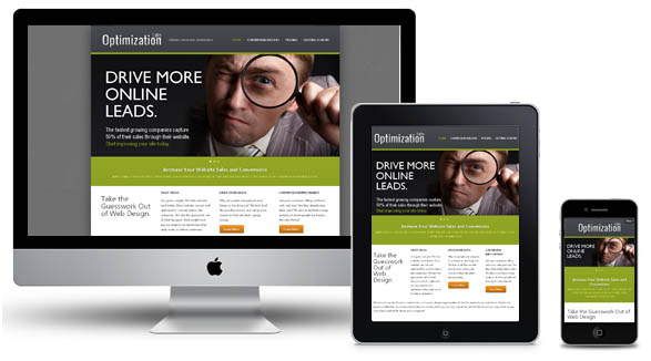
Most likely you have experienced the annoyance of trying to navigate a website on your phone that isn’t responsive. It simply doesn’t work well at all.
For most websites, mobile traffic has taken over as the primary visitor experience.
The best conversion actions for mobile devices are short and highly targeted engagements with your content because the visitor is after something specific. They may be commuting to work or reading in their car (yikes) or catching up on their email.
Because the engagement time is small, you have to give people a very compelling and easy to convert task.
It doesn’t matter if you are an e-commerce site or B2B software vendor, the funnel on for a mobile conversion must be short and very easy.
These days, you can detect mobile devices and present a unique view for mobile visitors that is simpler than the desktop version.
Take into consideration how swiping and tapping their way through a form is done to find ways of making the conversion easier for them.
With these types of growth numbers and the poor experience of standard websites on smartphones, it’s critical to rethink strategies for the mobile visitor, otherwise, sales will be lost.
If you use a content platform like WordPress or any open-source CMS, it may be a simple matter of just changing to one of the newer themes that have been published recently.
On any other platform, you’ll need to make a number of changes to modify your existing design, but it is well worth it.
It makes sense that a better user experience will drive more conversions.
Assuming its a good design, visitors will be able to find what they want easier, stay on the site longer and have a much greater chance at converting.
This is especially true for smaller e-commerce websites where the shopping experience is vastly improved with a responsive design that is tailored to the target platform.
With an increasing number of mobile devices and their level of sophistication, the importance of providing a good experience to this audience is critical to doing business online.
5 Traits of Compelling Headlines that Boost Conversion and Time On Page
What makes people read your blog posts or any page on your site?
If you think it’s your content, then you’re wrong.
The first things Internet users see are the headline and first paragraph, making these two key components of drawing in readers.
When your pages have compelling headlines that scream “click me!”, then you have a better chance of people doing so.
However, after the headline, it’s up to you to keep them engaged in the actual content. But to make that first great impression to boost customer engagement, you’ll first need to learn the five traits of high-performing headlines.
Trait One: Has Numbers in the Beginning
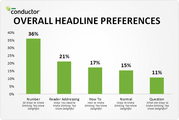
Did you know that headlines that have numbers have an astounding amount of click-throughs?
These articles are plastered all around the Internet (just like this article), such as news sites, blogs and even social media.
Studies using AB testing have been performed and what was discovered is that each and every time, headlines that contain numbers were a winner. See for yourself:
To go a little further in this research, The Content Marketing Institute reported that headlines that contain odd numbers had a click-through rate that was 20 percent higher.
You can test even and odds to see if it has an effect on your CTR.
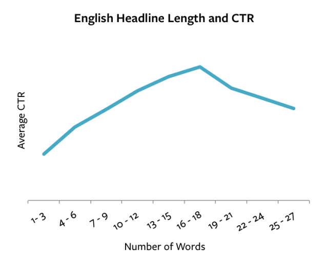
Trait Two: Has Between 5-9 or 16-18 Words
The amount of words that you have in your headlines plays a major role in click-through rates.
If you’re not careful, your headline could be too long, or not long enough.
According to The Guardian, headlines that contained eight words performed the best. There’s no reasoning behind why this is so, but it could have something to do with how the brain functions.
For instance, a 1956 psychological study was performed by George A. Miller from Princeton called The Magical Number Seven, Plus or Minus Two: Some Limits on Our Capacity for Processing Information concluded this same thing. The gist of his research was that the average mind was only able to hold 5 or 9 (7 +/- 2) objects in its working memory.
This is complemented by the research conducted by Jakob Nielsen, who found that Internet readers typically scanned Web content, with most attention gearing towards the first and last three words in headlines.
What was found to have the most impact, were the first two words and the first 11 characters.
For headlines that are a bit longer, a study done by Outbrain (based on paid links in their network) showed that click-through rates increased around the 16-18 word mark:
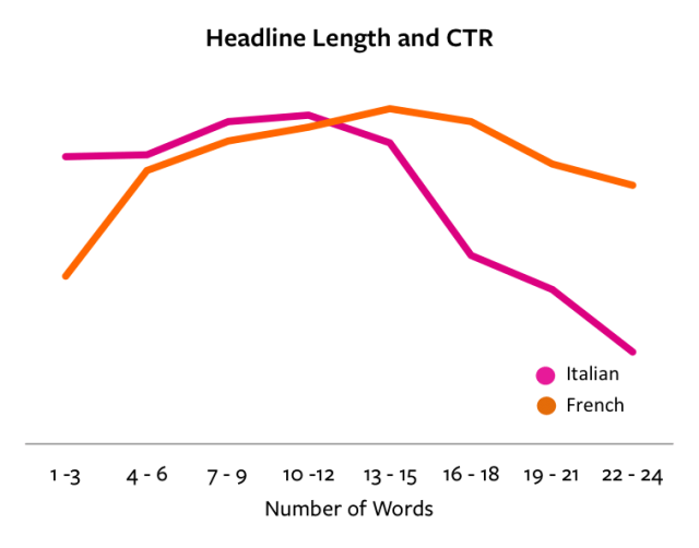
The same holds true for other languages, like Italian and French:
But why the major jump from 5-9 to 16-18? It could be because some paid advertisers believe in longer descriptive headlines draw in people, especially those who aren’t familiar with the content or the producer of the content.
Trait Three: Uses Negative Words
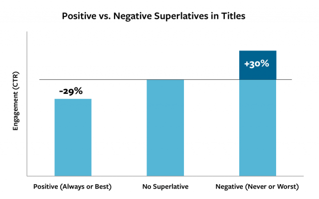
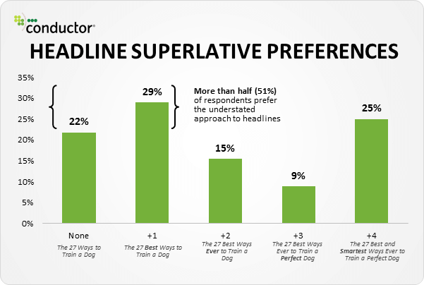
For decades, it was believed that headlines that had positive words were better for click-throughs, conversions, and shareability. However, in recent analyses, the opposite holds true. An example of positive words is: always, best and most. Negative word examples are: never and worst. To see how the two perform during testing conducted by Outbrain, see below:
To learn more about why this is so, here is the Outbrain study.
Here is another look at positives vs. negatives, and everything else in between:
Trait Four: Has a Beginning and End
Like a story, titles should have a start and a finish.
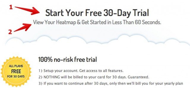
In headline terms, this means using a supporting subtitle.
According to CMI (Content Marketing Institute), when a hyphen or colon is placed in a headline for the purpose of a subtitle, it performed 9 percent better than those that didn’t have one.
Here is an example of a headline with a subtitle:
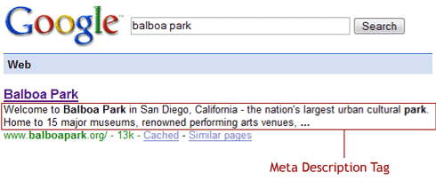
Another way to look at this is similar to how Google uses Meta descriptions beneath headlines:
The next time you go into a grocery store and are waiting in line, notice how magazines use this same concept for headlines on the side of the cover.
However, proof is always in the pudding in the Internet marketing world, which is why Timetrade.com tested this out by adding a sub-headline to their main-headline.
It saw conversions increase by a whopping 85 percent.
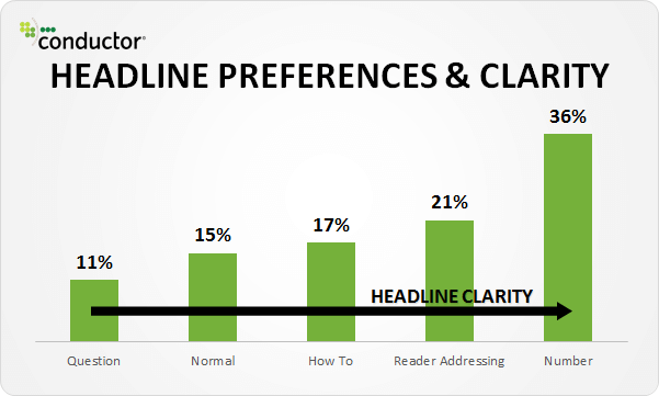
Trait Five: Has Clarity
This is a fairly simple trait that a lot of bloggers overlook. They get caught up in writing headlines that are over-the-top, but sometimes, simple and clear is all that’s needed to increase CTR.
Typical headlines use questions, how to, reader addressing and numbers.
However, the more specific your title is, the more likely the right people will click on it, thus boosting conversion rates.
Keep in mind that people don’t want to guess what they’re about to read, they want to know beforehand.
Combine these Five Traits to Boost Your Conversion Rates
The individual success that has been seen with these headline traits can be enhanced by combining two or more into each of your headlines. The better you get at writing titles, the better your click-through rates will be. Give these a try and let us know how well your posts perform.
Optimizing Your CTA Buttons
Button Optimization is one of the easiest, safest and fastest ways to improve form conversion and click through rates.
It has an instant impact on your website conversion rate and it is one of the easiest steps you can use to convince the executive team to embrace regular testing.
 How to Increase Conversions By 10-30% Immediately
If you’re like me, I find it frustrating to watch so much traffic coming to a website, but never turning into a possible lead.
You create wonderful content. You pour your heart into the content, but they still don’t turn into customers.
If you have a lot of visitors coming to your site, but they aren’t converting, it’s either because they are the wrong type of visitor or there is a problem with your website’s conversion action.
As a business and even a non-profit, we want more visitors to convert!
Website managers and marketing teams are measured on our ability to drive an ever-increasing number of leads to the sales teams.
If you’ve never embraced testing your designs, the time to start is now.
Button Optimization is one of the simplest places to start to understand AB testing and sell the executive decision-makers to invest more in engagement optimization.
Optimizing Your Buttons
There are two types of buttons that can be optimized.
Click through Buttons – used as a call to action for people to click on to get them to take an action you want, usually to a form.
Form Buttons – used by visitors to submit a form for whatever reason.
So what are some things you can change on buttons?
- Color changes – grab their attention with a contrasting button to the rest of your colors. It should be easy to see and not blend in with everything else. A button may be obvious to you but lost to others.
- Text changes – size, sense of urgency, relevant, truthful, soften, title casing,
- Adding icons – some buttons can have icons as simple as an arrow to convert visually what you want the person to do.
- Button size – the size of your button can impact conversions by simply being more visible and obvious
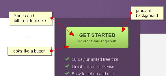
- Two lines of text – usually there is only one line of text in a button, but. A second smaller line can enhance the primary message.
- Graphic treatment– it should look like a button of course. Don’t go crazy, but think about adding a gradient, shadow or similar treatment as long as it doesn’t make the text hard to read
- Button position – the position of a button on a page will impact the number of conversions. If possible, change its position unless it is associated with a form.
- Hover Effect – test changing what your button looks like when the mouse hovers over it. The color can change, the font can change or any number of other actions. Just don’t change the readability of the text.
Get Started with Button Optimization
Now that you have some ideas to use for your Button Advancement project, get out there and try something new using an AB test.
Google Optimizer is a free tool you can easily use to test it out by simply copying a script into your page.
It may surprise you just how much it does affect your conversion rate.
How Do Videos Help Conversion Optimization?
A lot of marketers are trying to figure out the best way to increase conversion rates for their advertisements and landing pages.
The goal is to have as many quality visitors, convert into paying customers or at least give you their emails, as possible.
First, let’s look at using video in advertising like Facebook Ads.
Videos in Facebook Ads
We do a lot of Facebook advertising here and have found that videos (when done well and are very focused on a topic) outperform banners almost 2 to 1.
Natural videos (such as a person talking to you) tend to do better than a sales script or TV type commercial unless its just outright funny.
By default, videos will autoplay on Facebook unless someone has changed their settings, so be sure to use the first few seconds to capture the viewer’s attention because they are swiping through their posts quickly.
Make sure the video is relevant to the title of your ad as well. Titles with “How to [do something]” will usually capture attention over other headings.
Since you are recording video, you should have a good bit of extra content that you have recorded.
Test different versions of the video with different interest groups to find what converts best.
Testing variations with different audiences will help you find the conversions you’re looking for.
Finally (and I can’t stress this enough), make sure your ad ties in with your landing page or you’re going to lose your audience and waste your money.
So let’s look at how you should use video on landing pages (where you send your ad traffic).
There are three basic types of landing pages to get the best conversion.
- You can write compelling content to motivate people to fill out a form.
- You can create visually creative content with great text to get visitors to fill out that form.
- You can use a video with or without graphics and great text to drive people to fill out a form.
Each of these options will give you some conversion, but which is going to offer the most conversion?
Putting Together a Landing Page with Video
A landing page needs to engage a viewer within seconds.
Connecting with the visitor and their needs as fast as possible will have the greatest chance of success.
If you have a great headline that can immediately connect with the visitor’s need, text alone can be the right method, but it can be hard to come up with a really compelling headline that will catch their attention almost immediately just by itself.
Using relevant images on a landing page increases the likelihood of making the connection because it tells a story faster than words and can elicit a desired emotional response.
Using video on landing pages, whether it was from a paid campaign or through search traffic, has been found to have a mixed result, but when done well, it has a higher conversion rate than just photography alone.
Video on a landing page is not a new concept.
Initially, it was put at the top of a few landing pages as an experiment to get people to pay attention, and it was a quick success for most companies, so long as they did it right.
However, getting it right is the difficult part.
Not only did the video need to be engaging and start immediately, but it also needs to be just the right length and tell a compelling story.
The longer the videos get, the less they pay attention, and the more people left the pages instead of converting into buyers.
Video provider Wistia did some analysis on their viewers and found length really does matter.
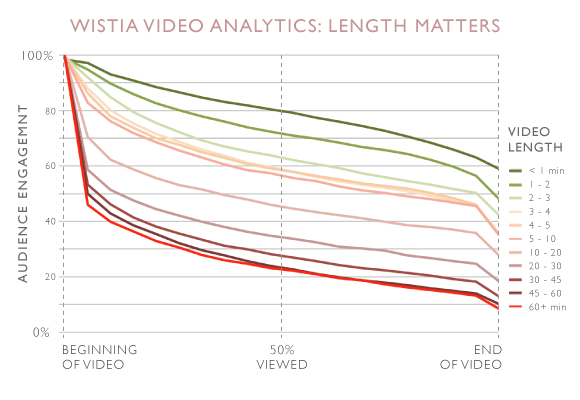
According to most research, including Wistia, that has been conducted on videos for conversions, the longest a video should be under 60 seconds, at least for conversions.
Anything over that and you risk turning that viewer away, even for the best content.
Videos designed to create conversions are not the same as what you will find shared in social media or other places.
These are specifically focused on identifying with the customer’s need to get them to fill out a form, buy a product or sign up for your service.
Want some more stats about using video for conversions, watch our quick 1-minute video.
Videos Alone Won’t Convert Viewers Into Buyers
With over 80% of website owners saying that having a video on their landing page has improved their bottom line, it is no wonder that people want to have them, but you cannot solely rely on them to make people buy what you are selling.
You need to have more and you need to inspire some type of emotion in your viewers quickly that you either “feel their pain” or you have the solution to “get rid of their pain”.
The best way to boost form conversions and drive sales is to find a way to incorporate the right headline, content, and graphics with a well-placed video on the landing page.
This will give people a hook from the beginning, and enough to keep them scrolling down the page until they reach the call to action. It needs to be the right balance for each type of content.
Getting to the right balance consists of using heatmaps and AB testing to see what converts the best.
Using the Right Videos in the Right Places for Conversion Success
The hardest part of using videos properly on landing pages is knowing what type of video to use (product demo, webinar on-demand, ad, emotional trigger) and where to put it.
You want to show off what it is you have to offer, but you also want to inspire trust, which is undoubtedly difficult in under 60 seconds if the visitor has never heard of your brand.
You need to figure out ways of balancing out proper video placement along with knowing why your audience is going to watch it.
If they want to see what your product does from the top of your page, then show how your product works.
However, it has been found, most sites will not be able to convert many viewers with this tactic.
Most of the time, a landing page is going to be set up with a video up near the top that introduces people to what your brand is by creating a story that people can connect with.
You want a video that is a simple introduction to how you solve a problem while eliciting an emotional response when possible.
Lower down on the page, you can place a quick snippet video showing what it is that your product can do that no other product is able to accomplish.
Additionally, in these videos, if it can show an actual customer giving a testimonial, this will help to instill confidence in many viewers while still allowing them to feel connected to your company and mission.
You need to just make sure that you are putting the right kind of videos with the right type of message in the most logical spots in order to get the biggest benefits out of each video.
The Benefits of Using Video on Your Landing Page
Aside from the ability to boost your conversion, videos on landing pages also have other benefits that you should consider.
A viewer that has gone through and watched your video is going to remember what it is that they saw and what it is that you were offering far beyond the end of the video.
This means that if you are going to show a 30-60 second video, you need to make sure the video has the appropriate amount of information for them to know what to do next.
You may not get the visitor to buy the first time they visit your website, but if you follow these rules, you will likely end up with their sale eventually.
1. It Gets The Message Across Faster
Viewers that have the option of watching a video or reading a page of text with the exact same words are nearly always going to choose to watch the video.
This can be due to ease, or time constraints.
You want engaging headlines and bits of content, but you do not want to bore your viewers. You want to inspire them to take action, and videos are a simple way of making that happen.
2. Appeal to a Wide Audience
Ideally, you are also going to want to make sure that the videos you pick are going to be friendly to your entire audience, not just one snippet of it.
You want your audience to see your video, feel inspired to find out more, and share that video on social media.
When you can inspire positive emotions in your viewers, they are more likely to share it, become buying customers and tell the people they know to do the same.
One conversion from a properly-placed video can turn into multiple sales.
This can also boost how many people are following what you have to say on social media, which can also boost the total number of sales.
3. Videos Increase Users Engagement
Videos can also help to boost your conversion rate in a way that can be difficult to match using text or images.
Once a viewer has started watching your video, you can decide where the climax of the video is, and request a person opt-into your email campaign to finish out the video.
This shows engagement, interest, and gives you more information that you can use to convert viewers into buyers down the line.
While you can have the same type of form pop up over text, it can be a lot harder to try and determine the right amount of time to wait before that form should appear.
Each person reads at a different rate, but each person that watches the video can have the form pop up at a specific part of the video itself, giving you the bonus email out of the process.
4. Increased Campaign Conversion Rates
At the end of the day, you need to know your customers really well before deciding that a video is going to be the key to converting your viewers into buyers.
While videos do tend to give a higher conversion rate, knowing your audience and telling a great story is going to give you the best chances of high conversion.
Know what they are going to come to you looking for, know how they are going to visit your landing page based on devices, and know-how to show them that you can solve their problems.
If you can do all of that with a video, then you are going to be able to have the best chances of seeing your bottom line rise.
What To Do When Conversion Optimization Tools Fail
I’m a big proponent of adaptive web design and conversion rate optimization.
I love the tools that are out there such as Google Opmitizer, Visual Website Optimizer and Unbounce.
But one thing I’ve learned over time using these tools is that they are subject to making inaccurate claims about a winner, giving the illusion that one concept is better than another.
Beware of Your Conversion Results
The primary issue I’ve found is that these tools are of course just software that follows rules that a programmer has given them.
They can be fooled into thinking there is a winner if there is a lot of traffic and one of the designs is converting a lot faster than the other design.
In many cases, the tool you use is probably right.
But I’ve found that sometimes if you wait long enough, those early winners are not really winners.
What happens, especially on sites that don’t change much, that has a loyal fan base, introducing something new is like bugs to a zapper.
It is very attractive because it catches their eye and they wonder what it is and click through.
So early on it will easily win out in this scenario and the optimization tool will declare a winner.
But if you keep testing longer, if visitors don’t really care about the change, you’ll see conversions drop back down to normal levels.
It is very possible that the new design will win, but not at the initial levels, but it is also possible that it is worse than previously.’
And If You Are Testing Your E-commerce …
Another similar problem arises of when you run a test, especially for e-commerce websites.
Just because something converts better during one part of the year, does not mean it will necessarily convert better at another time of the year.
For instance, the use of different colors on the site (green and red during Christmas) may work great during the rush, but wouldn’t work well at other points in the year.
Its about timing of what you test and recognizing that different things work different based on time of year and geographic region.
A Simple Fix
So, the result of this is that you shouldn’t stop the testing if you get an early winner.
Keep testing longer so that it normalizes and you get out all the bugs. Then you may want to try the test based on time of year or geography to help drive up those sales.
A little bit of personalization can really impact the bottom line in customer experience optimization.

 How to Increase Conversions By 10-30% Immediately